Examples

What can you build in one afternoon?

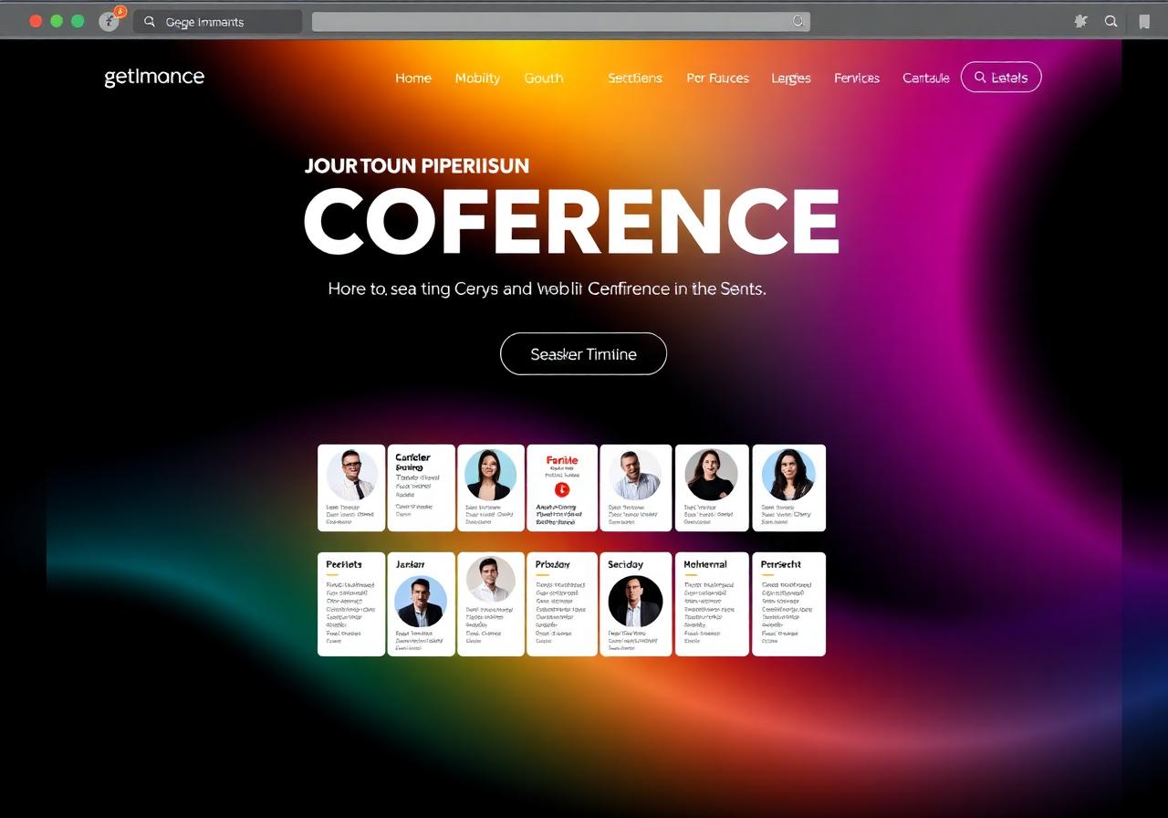
The images below are illustrations of what you can generate with Lovable. The text on the mockups is intentionally unreadable, what matters here is the structure and the style.

SAS projects

Work from our students, the ones we're proud of.

From Mexico, Dubai, Hungary. From a 12 year old summer camper to a 70+ year old retired author. All built with the same tool you can learn too.

Use-case gallery

Six styles, six genres.

Cafe landing page
Cafe landing page
Marketing
Fitness tracker
Fitness tracker
Web app
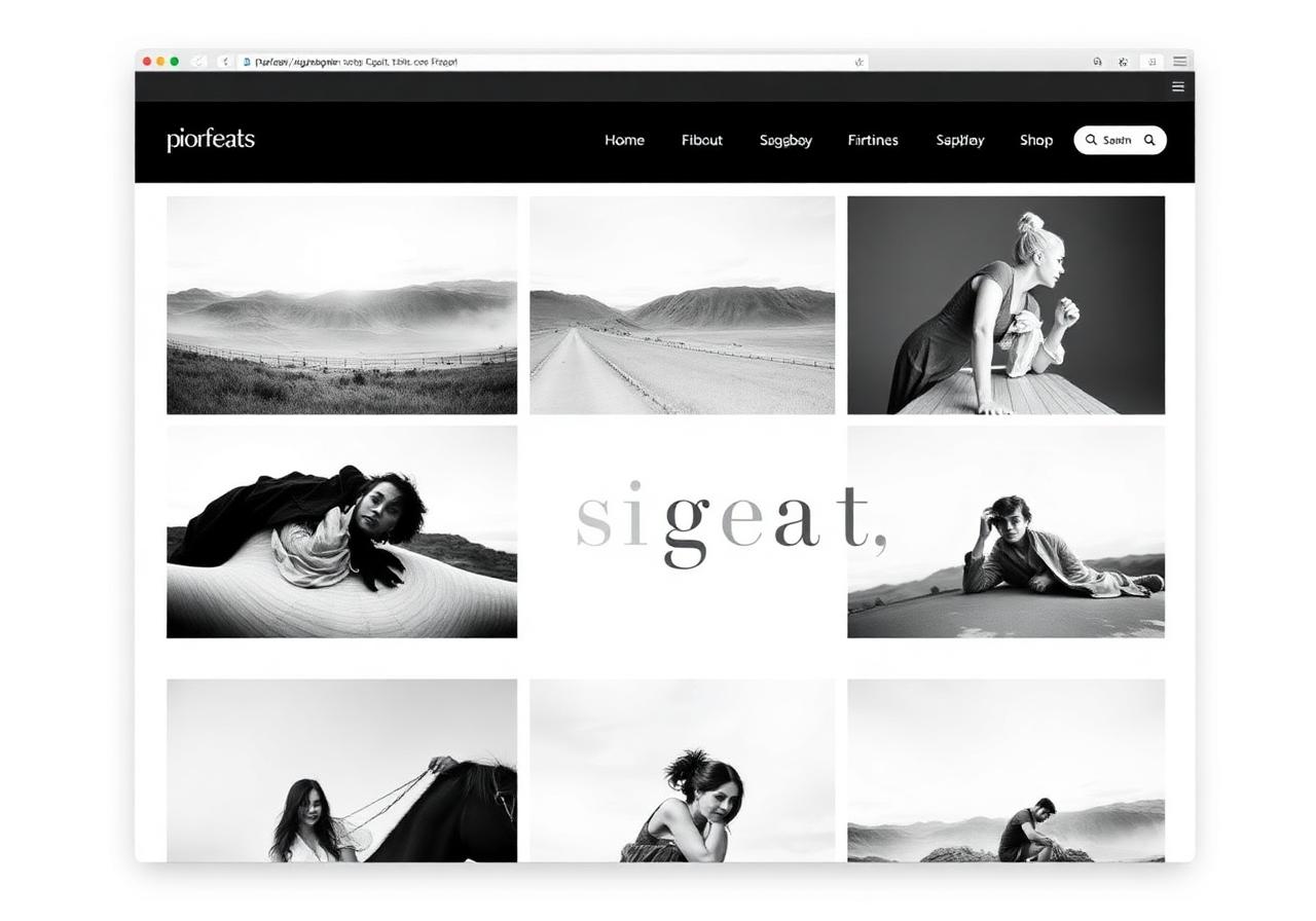
Photographer portfolio
Personal
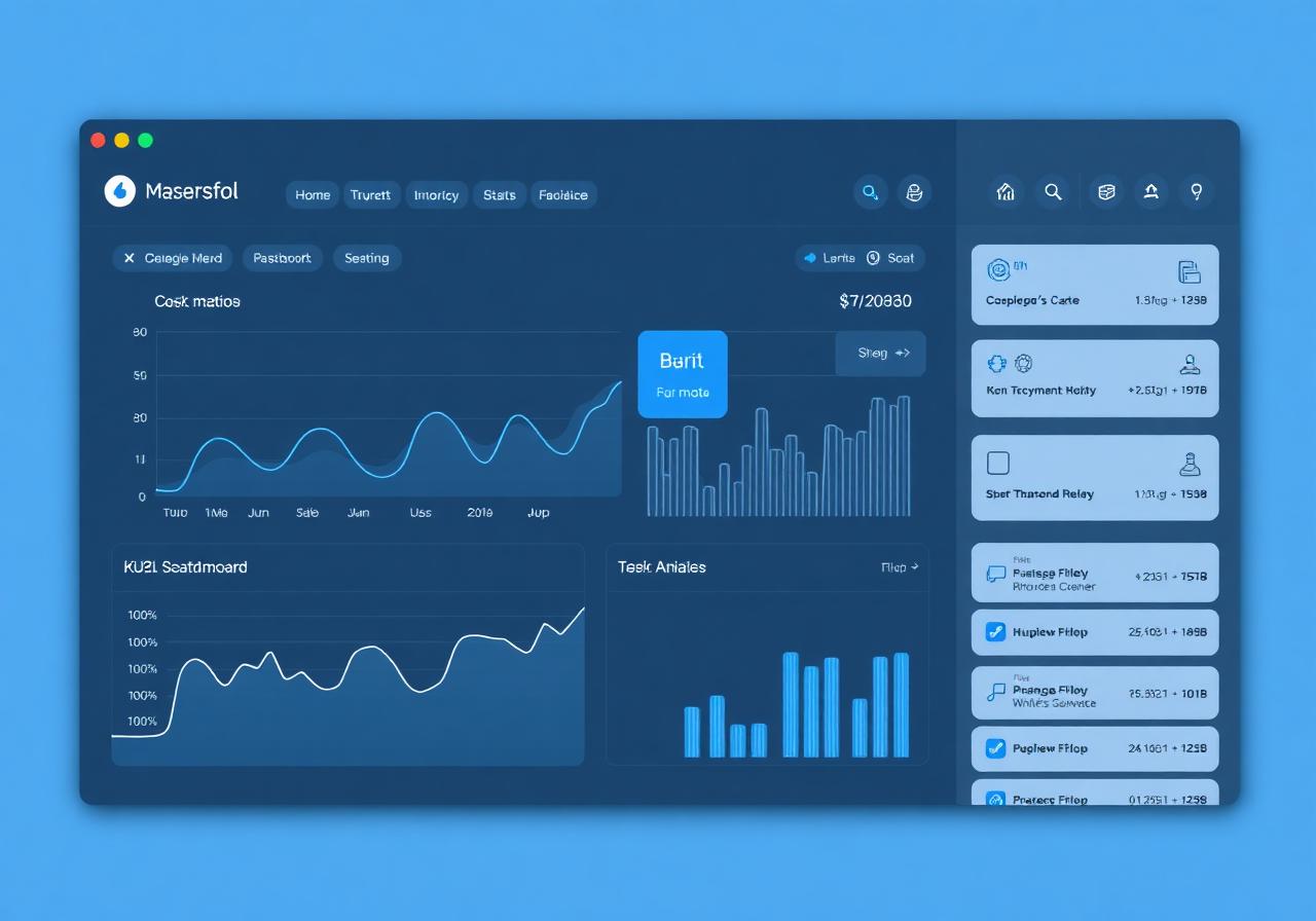
SaaS dashboard
SaaS dashboard
Internal tool
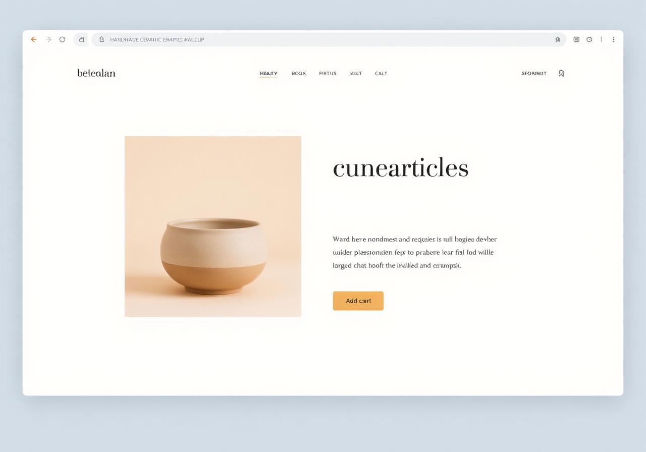
Ceramics shop
Ceramics shop
E-commerce
Conference site
Conference site
Event
Case studies

Seven prompts, seven worlds.

The first is the simplest prompt I can imagine. Each one after that needs a bit more prep. All of them are real.

Example #1
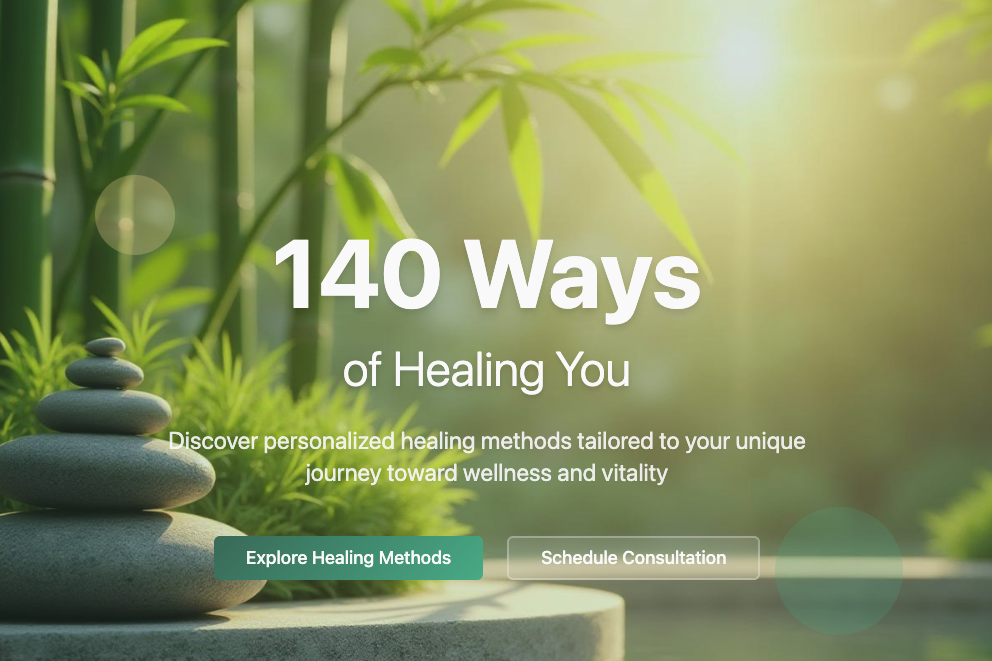
"I need a website for this plan: We have 140 ways of healing you. Interested?"

One evocative sentence. No style, no colors, no features specified. The result was a calm, list-based page that still holds up in production.

Takeaway

Sometimes one sentence is enough, if it's already a concept on its own. "140" + "ways" + "healing" are three words that give you structure (it becomes a list) and an emotional tone at once. Do you have a title that's a story by itself?
See it live
140 ways of healing you, mockup
Example #2
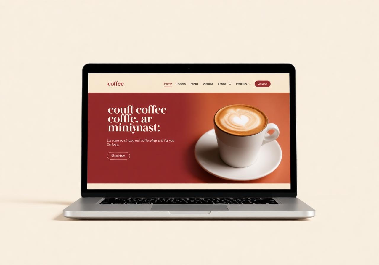
"Modern cafe landing page, warm burgundy and cream palette, large serif headline, hero photo with a latte, booking form."

A concrete style plus a concrete feature, packed into one sentence. A full landing page in a few minutes, and it still holds up in production.

Takeaway

Palette plus typography plus one specific feature almost always gets you a usable first version. If you can name these three things, Lovable starts in the right direction.

Cafe landing page mockup
Example #3
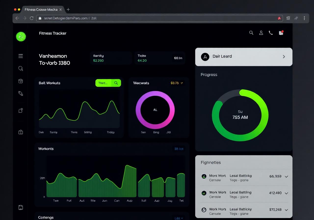
"Dark fitness tracker dashboard, neon green accent, workout chart, progress ring, sidebar navigation."

A dashboard-style app, not a marketing page. A database connection can be added in two more prompts.

Takeaway

Lovable isn't just for landing pages. If you use dashboard vocabulary (sidebar, progress ring, chart), that's exactly what you'll get. The backend comes next, not first.

Fitness tracker dashboard mockup
Example #4
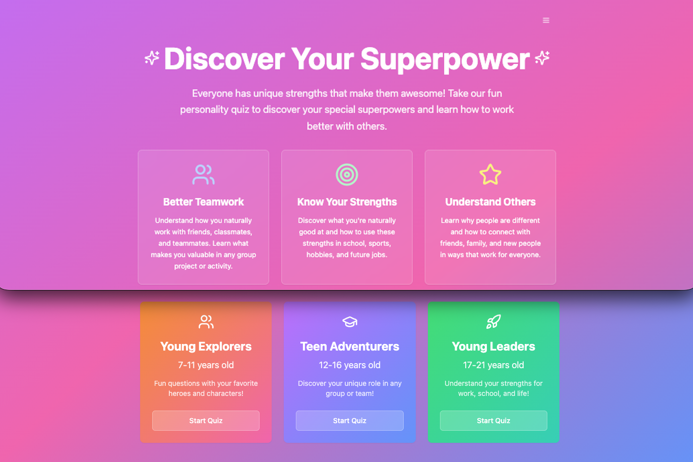
"Design an interactive, mobile-first personality quiz for kids and teens (ages 7-21) that translates DISC theory into a 'Superpower' framework. Create four core archetypes (D, I, S, C) using strengths-based personas that feel exciting and relatable to each age group. The interface should be intuitive, game-like, and focus on the value of combining different 'superpowers' to build better communities."

This isn't just a page anymore, it's a working quiz for three age groups. A psychological model (DISC) translated into a playful 'superpower' framework.

Takeaway

When a prompt translates a theoretical model for a specific audience (age, tone, mechanics), Lovable hands back logic, not just design. State the goal, the audience, and the metaphor, in that order.

Try it
Discover Your Superpower quiz, mockup
Example #5
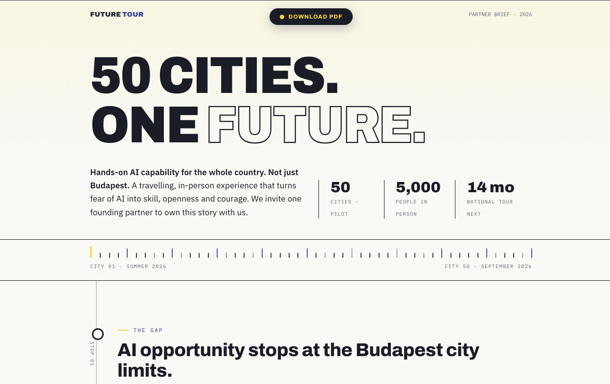
"Partner brief page for Future Tour, a 50-city AI roadshow. Editorial magazine style, contrasting yellow and deep blue, oversized display type, stats and a timeline, a downloadable PDF button up top."

A web link is often more professional than sending a PPT or a PDF attachment. It stays current, is easy to update, and never gets stuck in someone's inbox.

Takeaway

For a proposal, a project pitch, or a sponsorship ask, a single web page often beats a slide deck. The vocabulary 'magazine style' plus 'oversized type' instantly gives it a serious, editorial feel.

See it live
Future Tour partner brief, mockup
Example #6
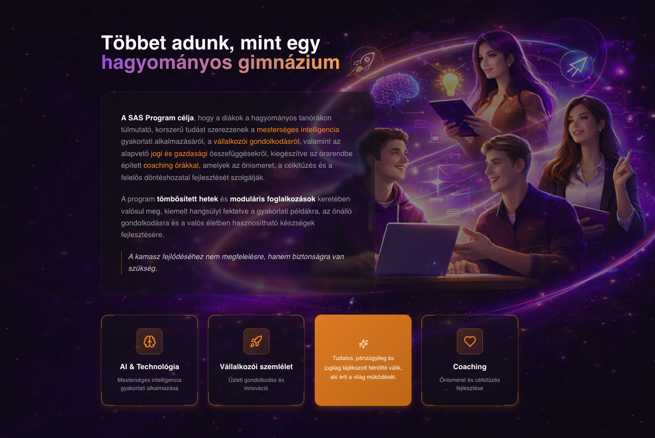
"Private school website. Dark, premium mood, purple and orange accents, embedded YouTube and podcast episodes in a phone mockup, video background in the hero section, an Instagram reels feed at the bottom."

This wasn't a one-day job. There was prep work: base copy in Google Drive, photos of students, a library of social links. Roughly 50-70 credits for a site like this.

Takeaway

The more real content you have ready (copy, photos, video links, podcast embeds, a social feed), the better the result. This is where preparation really pays off.

See it live
SAS Budapest private school website, mockup
Example #7
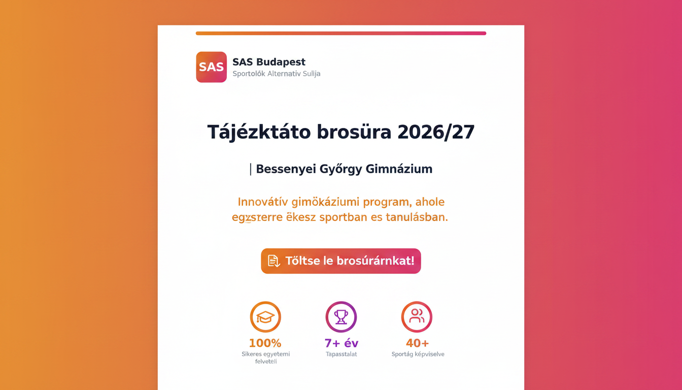
"One-page PDF info brochure for a high school program. SAS brand, orange-pink gradient, a big download button up top, three key stats (100%, 7+ years, 40+ sports) with icons, detailed program sections below."

You don't always need a website. For a school introduction, an event, a product, or a service, a downloadable PDF flyer is often exactly enough, and it can be built with Lovable too.

Takeaway

Lovable isn't just for interactive apps. Even if the end result is something printable or downloadable, it's still worth designing here, because you get a matching web version afterward, for free.

SAS info brochure, mockup

Curious about the other players?

See how Lovable stacks up against Bolt, v0, Replit Agent and Cursor, or dive straight into your own first project.